In my case, I am creating an infographic resume for the fictious client Jane Johnson. In this case, I create a new Letter-sized Illustrator file which is 8.5 × 11 inches and in a color mode of CMYK as I did in Chapter 4. And I have created a separate guide layer so
that I know where my margins are. Refer to Figure 9-2.
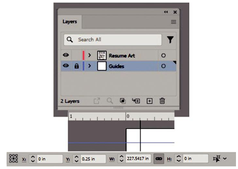
Figure 9-2. Use the Layers panel and guides to put your guides on a separate locked layer
In this case, I have the guides placed 0.25 inches surround margin on each side. I dragged these guides out from my ruler and adjusted them using the Control panel and then locked the layer. The guide lines will not print. I used my Control panel to adjust the x and y coordinates of the guides and then locked the layer. Horizontal guides sit at Top X:0 in/Y:0.25 in and the lower at X:0 in/Y:10.75 in. Vertical guides at left X:0.25 in/Y:0 in and the right X:8.25 in/Y:0 in.
Generally, it is assumed for some infographic resumes that they will be made into a PDF file and then just viewed online in the browser or on the desktop of your computer using Acrobat Reader. However, if you are sending the resume to a client that likes to print out copies for their records, I would consider not having a solid color or black background as that will waste a lot of toner. In my case, I just left the background white as white space and the balance of separated items let the eyes rest. The only area I blocked off in a gray area was the About Me section. The 0.25-in margins also ensure that important parts of the design are not cut off like text during printing. Refer to Figure 9-3.
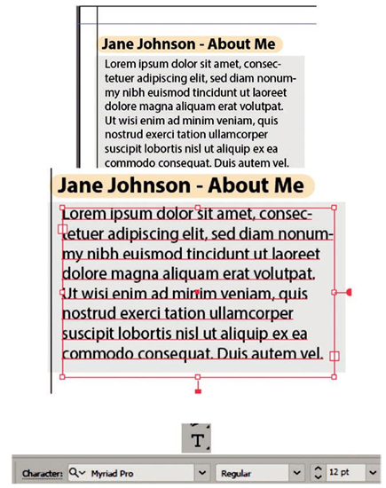
Figure 9-3. Text area created on the resume and text added edited in the Control panel
The About Me section and all the artwork are on the top layer “Resume Art.” For the text, I just dragged out a rectangular text area with the Type tool over the rectangle background, and it filled with placeholder text. You could then type in a new text with your Type tool when you highlight the text. For consistency, throughout I used one font family in various sizes and the two styles of regular and bold.
Note Around important headings, I have put a rounded rectangle that is colored and then used the opacity slider to make the text more visible but still add some color behind the type. Refer to Figure 9-4.
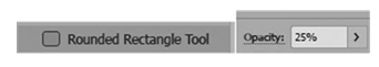
Figure 9-4. Use the Rounded Rectangle tool to add a rectangle behind the text and lower the opacity
I then used my Pen tool and basic shapes to draw some shapes for my contact area. I then Object ➤ grouped each of them so I could move them as one object on the artboard. With these shapes that I have created, I could then drag them into my Symbols panel and save them for other areas if required on my resume. Refer to Figure 9-5.
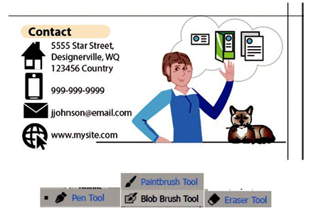
Figure 9-5. Create icons that you can add to your contact area as well as a logo or illustration of yourself that you create with various brush tools